

For the most part, the brand owner and marketer know that their product labelling or packaging must connect with the consumer during those few moments of consumer/product face time. If flagging sales suggest that is not happening then perhaps a reappraisal of product presentation is called for.
With the aid of designers and suppliers and the converter, a complete product refresh and a new product launch may be an option. This may stimulate interest but can be costly and might not generate enough profit to counter the expense of a re-launch. Worse still, a new product may seem innovative with the board, the marketing department, and the production team; everyone may think it’s just what the market needs and that consumers will purchase in droves – but they don’t. For whatever reason, it may be that the timing is wrong, that the item is deemed too expensive or even surprisingly that it wasn’t expensive enough.
Consumer behaviour
Consumers can seem perfidious. Some product categories, perfumery for example, are aspirational focussed: if it’s too affordable the consumer will probably avoid purchasing it. The same applies to beverage goods especially wine and some spirits.
The marketing, distribution and selling of wine is big business and highly competitive. Consumers have a bewildering array of wines to choose from. Consider for example that California alone is said to have nearly 3,000 wineries. And that’s without counting the established wines from France, Spain and elsewhere. No wonder there is a degree of head-scratching and intense scrutiny by consumers when faced with racks of varied and competing bottles of wine adorned with labels vying for attention. There are the true connoisseurs of fine wine and then there are the wine snobs or bores; then there are the rest of us; the majority of consumers who buy according to price and the look of the label.
After all, the label is really all the purchaser has to go on. Even the less adventurous, those that have hit upon a wine that they like by chance and stay with it down the years: it is probably a safe bet to say that it was the design and colour of the label that attracted them and helped influence the initial purchase.
Labels must make a connection
The attributes of the wine, the bouquet, flavour and palatability cannot be evaluated until the consumer opens the bottle. This means that the label must make a connection subliminal or otherwise both with the wine and the consumer. The label must have some depth and meaning, something relevant that draws the customer in so as to take a chance on a tryout.
Designers and marketers have long known that colour and suitable graphics drive sales. Wine can have an allure about it; perhaps a pedigree that commands attention. In this instance, an elegantly designed label incorporating gold embossing may be the order of the day. That is not to say that simple clean-cut lines and a limited colour palate don’t have a place. Small wineries, especially those introducing a non-pretentious wine aimed at the cost-conscious may take a minimalist approach to colour in order to differentiate their labels from others.
While colour and graphics can help build a relationship between the brand and the consumer this can’t just be ordered up and taken for granted. It takes the designer as the diviner of colour and the marketer, the builder of associations to provide overall brand design. It is the converters’ role to interpret the concept in a reproducible and meaningful manner.
Colour and other subtleties
Interpreting colour and getting it right time after time and run after run remains a challenge. It’s not just about colour it’s also about the subtleties associated with tone and depth. So many variables can influence colour outcome. For example, paper brightness, surface quality and neutrality or deviance from colour cast, all have a dramatic effect on how colour inks will appear printed on the surface. Switching to a different paper brand may have a dramatic effect on how a viewer may view a colour.
Printing white on clear film for example is a problem, even with opaque inks. Most ink colours require a proportion of light to pass through the ink film and then to be reflected back in order to provide the correct match. If the substrate absorbs too great a proportion of the spectrum from the illuminating light, the perceived colour will not match the customer’s agreed colour requirements.
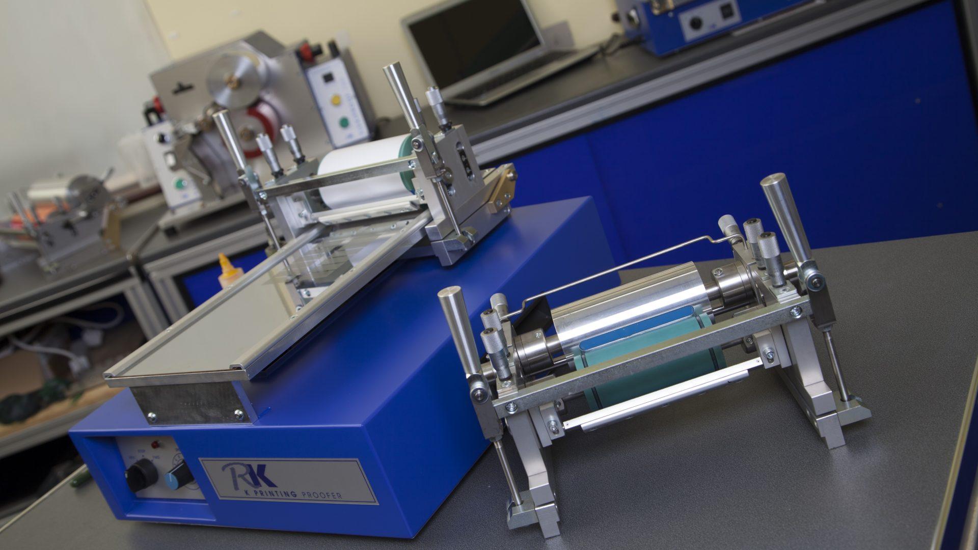
Pre-press functions as a distinct process that lies between design and printing and it can add significant value to the overall print process. A major part of pre-press is associated with producing accurate proofs that printers and indeed many others can match at the earliest part of the production cycle. Pre-press communication devices such as RK Print Coat Instruments FlexiProof 100 and variant FlexiProof UV and FlexiProof LED UV help highlight and resolve many of the flexo ink and ink/substrate-related issues that occur and which affect the quality of output such as for example, miss-matched colour and which can be time-consuming to resolve on the flexo press and which generates high levels of waste, downtime and lower levels of productivity.
Written by Tom Kerchiss, Chairman of RK Print Coat Instruments Ltd.
Caption: The K Printing Proofer, a multi-print process device, is able to produce accurate flexo, gravure and gravure-offset proofs for colour matching. Laminating samples is an additional benefit.