

Short run lengths, fast turnaround times and a willingness on the part of customers to take their business elsewhere if quality fails to meet expectations are just some of the realities that printers and converters must contend with. Those that print and convert are obliged to control process variables as best they can so that a consistent product, with accurate colour, innovative graphics and with text that is readable, is output in the shortest time possible, in order to realise a reasonable profit.
What makes working with colour both fascinating and, in equal measure, frustrating is the vast number of variables involved. This becomes very apparent when something goes awry, when trying to quantify a colour or when confronted with the need to match a specific colour or colours to specific profiles and colour standards.
Experience and a skilled eye are no longer enough
In the past, both formulators and printers relied solely on experience and a skilled eye to match colours. As time has gone by, colour profile adjustment software, spectrophotometers, and other devices to measure, monitor and control many of the parameters associated with colour communication have become available and, to a certain extent, have made life theoretically easier. However, one must never forget that while these aids enable users to place colour communication within a scientific context, ultimately success or failure is dependent upon how the viewer reacts to that colour, and that’s where many of the problems begin.
Colour has such a powerful influence and plays an important role in building a winning brand. Achieving consistency in colour can be difficult for many reasons. When viewing and interpreting colour and in matching one colour, for example, against another, we must consider the quality of the light and we must make allowances for inconsistencies in vision. Tiredness or fatigue, and even age, affect how we interpret colour. So too does the colour of light, under yellow tungsten light, for example, there is a tendency to confuse a yellow colour with white or dark blue may seem black.
The characteristics or properties of light can vary, and it is essential that designers, packaging technologists and brand owners bear in mind that lighting conditions will be very different in the retail environment than in the controlled lighting conditions of a viewing booth and pre-press department.
Other illuminating issues include geometric metamerism, a phenomenon exhibited by colours that appear to match at one angle of illumination and viewing, but then no longer match when the angle of illumination is changed. This can be caused by gloss and/or irregularities in substrate surface texture. Sometimes the light scattering characteristics of, for example, an opaque white ink layer that affects the appearance and colour of the finished product. If that isn’t enough, the colour of the substrate surface and drying/absorption properties affect colour reproduction.
The physical and chemical structure of a pigment, the size and even the shape of its particles, contribute to the reflective properties of the colourant and the hue. The amount of pigment influences colour strength, while the type of vehicle used can affect both the hue and value of the colour.
Consistent results in flexography
Consistent results in flexography are, to some degree, dependent upon how much ink is deposited on the plate and on the substrate. Given the right circumstances, there are quality and performance-related advantages to be made by applying the minimum of ink, for example, speedier drying. Flexo printing thin using an appropriate anilox roll and doctor blade not only makes sense with speedier throughput and cost savings, but large solids appear even and consistent, line work improves, and type prints sharper because the surface of the plate tends not to build up on the shoulders as readily. Reverse type benefits the most: less ink allows for a smaller point size to be reproduced with less risk of fill-in.
By printing smaller, lower percentage dots, the flexo packaging printer should be able to reproduce lighter or more defined highlight areas. In addition, when a high percentage of dots are open, there is better shadow definition. By depositing a thinner ink film, there should be less variability and a reduced risk of quality-associated problems. There is more latitude in plate pressure settings, while impression settings are more forgiving as there is less ink to skew the separation. The smaller amount of ink on the tip of the dot is more difficult to distort.
For optimum results, a high line count anilox is recommended; a lower volume anilox uses a smaller cell with shallower engraving depths, which hold less ink, which in turn produces a thinner ink film.
Converters that print must be aware that ink film thickness limits the pigment/ratios needed for some applications. For example, a customer wants the converter to flexo print a job that contains a very bright, deep red. Even a slight absorption increase in the stock will cause the high concentration of pigment particles to protrude through the surface varnish layer, making the print less glossy and lighter, a colour with no body. The flexo operative might overcompensate by increasing the ink film; if close to maximum the result may well be line patterns, mottling and the possibility of offsetting on the backside.
A slightly lighter red allows for less pigment loading and allows for thinner ink films to be printed. If, as is often the case, the customer is insistent on the deeper, richer, darker red, the printer can try making two impressions, wet on wet. Colour communicative devices enable users of many descriptions to colour match and determine optimal thickness by running various test rolls with several engraving specifications or bands across the roll.
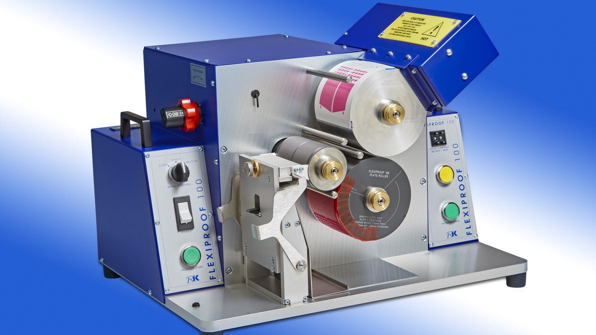
FlexiProof100
The FlexiProof100 and variants, FexiProof UV and LED UV, can be supplied with ceramic anilox rollers, each having two engraved bands. These rollers range from those engraved with 55 cells per linear inch, with a volume of approximately 28 cm3/m2 and the FLX 1000.1 with 1000 cells per linear inch and a volume of 3.0 Cbm³/m².
Notwithstanding the subjectivity of colour representation, it is very necessary to be able to document processes and establish measurement parameters. Typically, colour variability is defined as the Delta E between 1 and 2 is generally acceptable, but there are applications where the Delta E must be kept lower. In order to meet colour targets, colour-matching capabilities must be precise, and there must be good ink pre-press to press correlation. Printers want colour matches and targets that they can actually print.
The FlexiProof family of devices enable users to colour match off press and resolve ink and other related issues, minimising on-press waste and providing savings in areas such as time, energy costs and press downtime, etc.
Written by Tom Kerchiss, Chairman of RK Print Coat Instruments.