

While colour is used to great effect in combination with other design elements for most product categories, the one that seems to inspire designers, brand owners, marketers, converters and others in the supply chain to be particularly creative is the food and beverage items displayed in the babies and toddler aisle of supermarkets.
Adults purchase items in stand-up pouches (SUPs) and other constructs for toddlers, but that’s not to say that children are not without influence. Parents are more likely to make a purchase if their toddler responds positively to an imaginatively created package or labelling that the adult also endorses.
Sustained interest
Convenience, design and colour encourage potential adult purchasers to pick up and handle the pouch or other items. Toddlers at the self-feeding stage benefit from products such as single-serve, self-.contained pouches that incorporate a spout for no mess eating and ease of use. Pack graphics and colour are important in that they sustain interest and are an effective signpost for consumers making a repeat purchase.
Readable and informative text detailing food standard accreditation, ingredients – their source and without exaggeration, health benefits: guidance related to the structure of the pack or pouch and disposal after use are of importance. Consumers, environmentalists and legislators want to know whether the packaging structure aligns with recycling objectives and regulations aimed at reducing materials finding their way to landfill.
Pouches provide for unique design opportunities, particularly with regard to tiny tots and pre-mainstream primary school children. A storyboard approach to presentation, often incorporating recognisable cartoon characters, works to great effect in that it personalises not only the juice or dessert being considered for purchase by the parent or grandparent at that time, but all other product lines within the brand.
Pouches may be configured in convenient single sizes; they may be constructed with dual compartments, with or without perforations. One compartment could contain solids or a main course; the second compartment could give way to a pureed dessert. Space-saving and made from chemically inert shelf-stable structures, such as the thermally sterilised retort pouch, are a safe way to quickly provide a hungry toddler with a heated meal.
Shaped pouch formats can provide a product with distinction. Pouches, for example, can be configured with indentations that more easily enable the youngster to grip the product. Shaped pouches can include spouts, nozzles and other aids. They also partner up nicely with canisters, bottles and containers or mini-snack boxes for promotional try-out offers and for various other marketing campaigns.
Packaging from a marketing perspective tends to work better when it is designed to meet the requirements of the various visual zones that the consumer may come across in a well-laid-out retail outlet. Even when the pouch is shaped, incorporates a spout or other consumer convenience and embellishment, its colour and graphics are responsible for making that first connection with an undecided consumer. This marketing accepted recognition zone is regarded as being around 3 metres between consumer and product; it’s where colour and brand association or familiarity kick in.
Purchase decisions
The curiosity or zone of comparison is where an item is picked up and handled, and a decision whether to purchase or decline is made. This zone is where issues such as out-of-spec colour, pinholes and blemishes become very apparent. If colour or graphics or on-pack information fails to impress, the goods may be put back on the shelf. On-pack graphics might contain a child-centric character, such as Roald Dahl’s BFG or Big Friendly Giant or a recognisable cartoon character or animal.
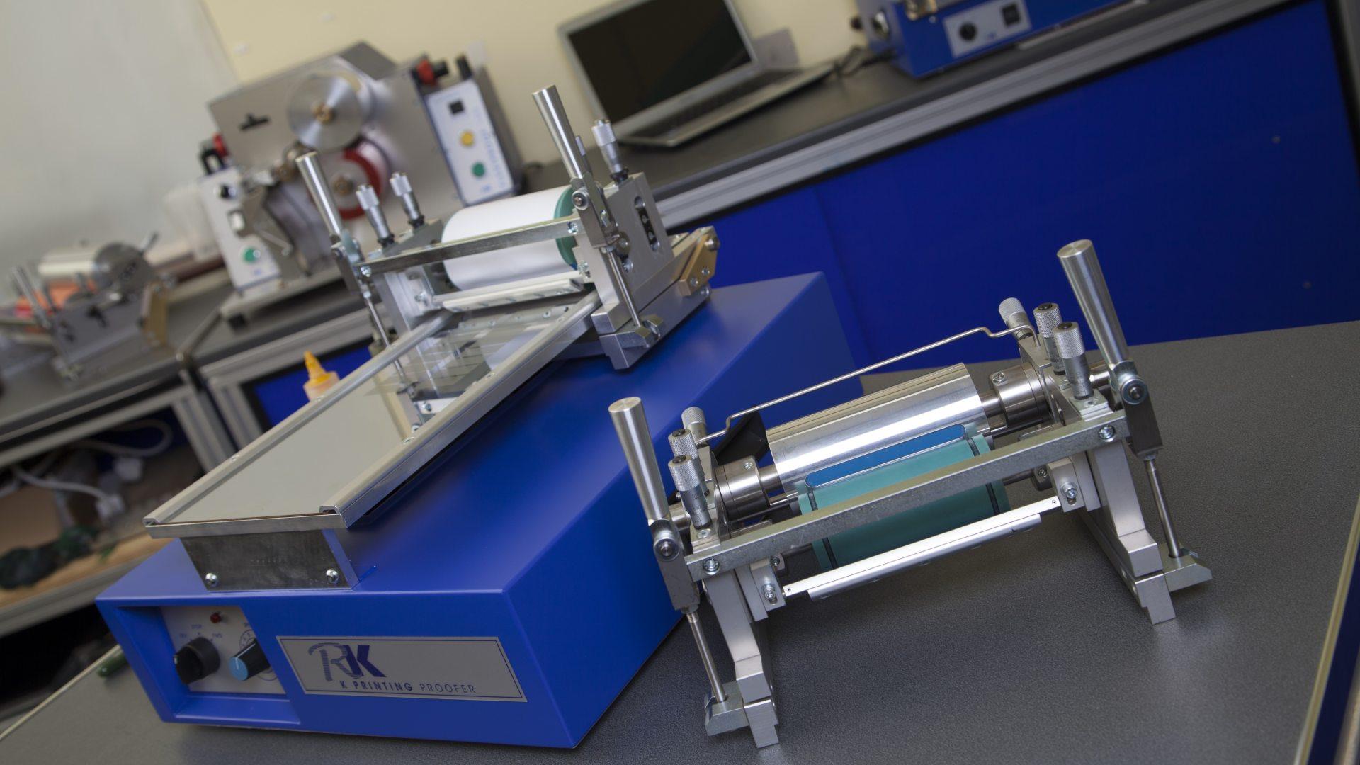
Colour communication, sampling and proofing devices enable users of many descriptions to meet colour targets and achieve other print and coating objectives quickly and without the high levels of waste that can occur when trialling materials or resolving an issue on press.
With the K Printing Proofer, users can obtain high-quality proofs using gravure, gravure-offset or flexographic inks. Two or more inks can be printed simultaneously for comparison purposes, and registration is included for overprinting. Wet and dry laminated samples can be produced by using the gravure print head in conjunction with RK Print Coat Instruments’ own K-Lam, laminating accessories.
Consumers are much more mindful of environmental issues and are taking greater interest in recyclability and sustainability. Purchasers of food and beverages for babies and small children are watchful advocates of change and can be a vocal pressure group.
The VCML lab/pilot coater enables operators to print, coat and laminate onto all types of flexible substrates. It has the ability to apply various inks, varnishes, adhesives and even paint using environmentally acceptable formulations: water-based. It offers short-run production capability, making it ideal for bringing products to market, for monitoring quality and for undertaking many types of tests and procedures. It may smooth the way for converters and other interested parties in the transition from multi-web constructs to mono-web and other materials.
Written by Tom Kerchiss, Chairman of RK Print Coat Instruments Ltd.